Table of Contents
The Problem: Dashboards That Don’t Inspire Action
We’ve all opened a dashboard expecting insights, only to find cluttered charts and generic visuals. While Microsoft Power BI is one of the best analytics platforms in the world, its default templates often fall short.
Here’s why:
- Too generic → Dashboards don’t align with industry-specific KPIs.
- Flat visuals → Users disengage with dull, spreadsheet-like reports.
- Slow design → Teams waste time customizing dashboards from scratch.
- Limited collaboration → Iterating designs within Power BI alone is frustrating.
The result? Low adoption and missed business opportunities.
The Solution: Figma + Power BI
Pairing Figma’s design power with Power BI’s data engine changes everything. Instead of struggling with dashboards that look “just okay,” you get dashboards that are professional, user-friendly, and business-ready.
1. Rapid Dashboard Prototyping in Figma
With Figma, teams can:
- Design dashboards before building them in Power BI
- Test multiple layouts quickly
- Collaborate in real time with stakeholders
- Ensure pixel-perfect branding with consistent colors, fonts, and styles
This means faster iteration and less wasted time inside Power BI.
2. Consistency with Power BI Graphs’ Figma UI Kit
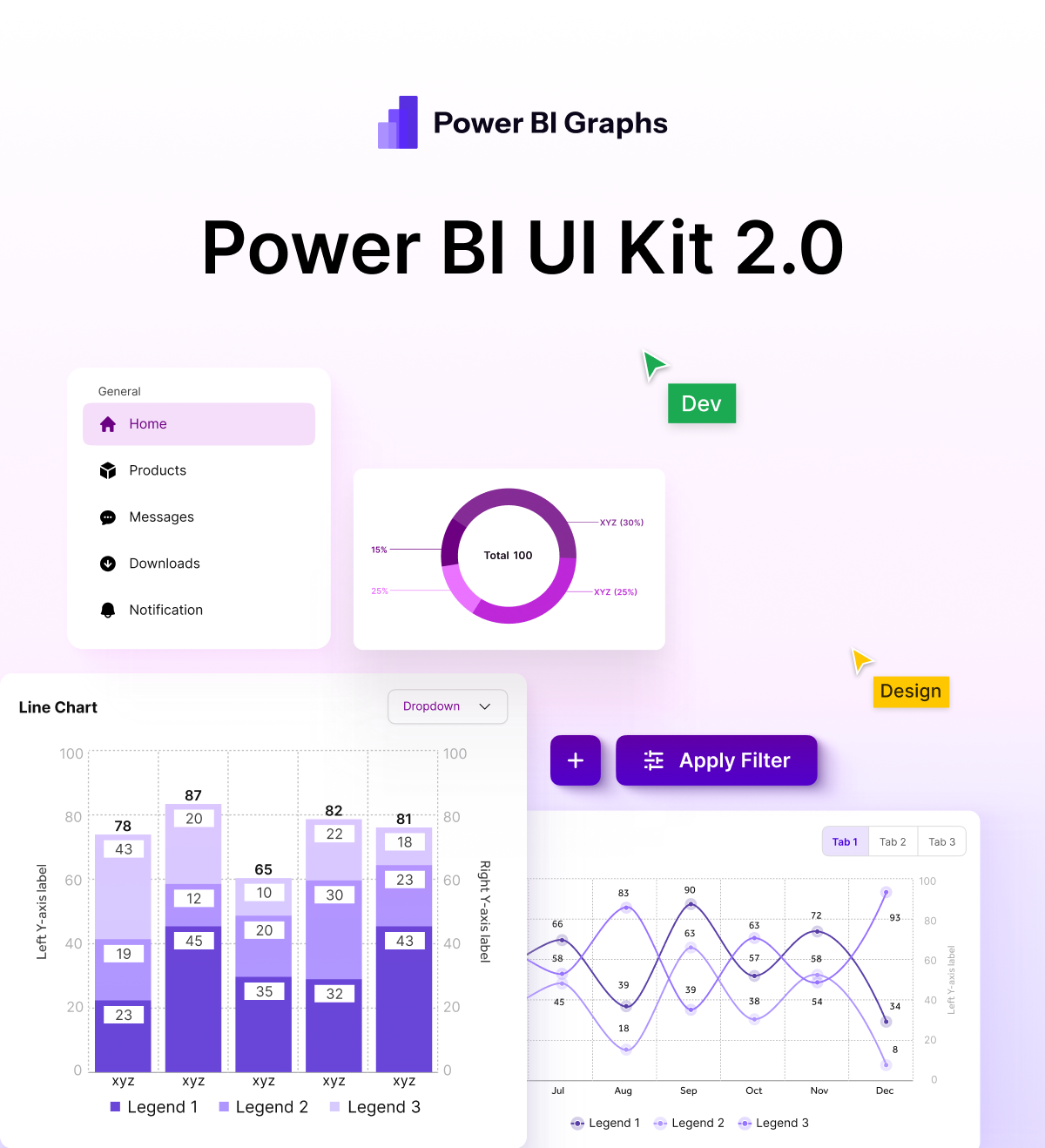
At Power BI Graphs, we’ve created a Figma UI Kit for Power BI (desktop + mobile) so you don’t have to start from scratch.
Our kit includes:
- Pre-built layouts for common dashboard use cases
- Ready-to-use mobile and desktop designs
- Scalable components to match your brand identity
- Industry-specific variations for finance, retail, healthcare, logistics, and more
Result: Dashboards that look modern, professional, and on-brand — designed in half the time.
3. Better Mobile Dashboards
Executives and field teams often rely on mobile dashboards, but the default Power BI mobile app is restrictive.
By prototyping mobile-first dashboards in Figma, you can:
- Optimize layouts for smaller screens
- Build touch-friendly, interactive experiences
- Ensure KPIs are easy to access anytime, anywhere
With custom mobile apps powered by Power BI Graphs, you can go even further delivering an enhanced user experience tailored to your workflows.
The Business Benefits
Upgrading your dashboard design process with Figma + Power BI delivers measurable results:
- Clarity → Insights that are easy to understand at a glance
- Speed → Dashboards built and adopted faster
- Engagement → Tools employees want to use daily
- Scalability → Templates and kits that grow with your business
Brand consistency → Visuals aligned with your corporate identity
Why Businesses Choose Power BI Graphs
At Power BI Graphs, we specialize in making Power BI dashboards more powerful, beautiful, and user-friendly.
We offer:
- Figma UI Kit for Power BI → Save hours with ready-to-use templates
- Industry-specific dashboard designs → Tailored to your KPIs
Custom mobile apps with interactive graphs → Taking Power BI beyond desktop
Conclusion: Design + Data = Action
Dashboards shouldn’t just display numbers — they should drive decisions. With Figma + Power BI, you unlock dashboards that inspire, engage, and scale with your business.
- Explore our Figma UI Kit for Power BI
- Book a Discovery Call for a custom dashboard solution
- Learn more about our Mobile App Development services
Power BI Graphs: Where design meets data.


