

Table of Contents
A great dashboard isn’t just about data it’s about clarity, usability, and design. Power BI is one of the most powerful business intelligence tools out there, but even the best tool can’t save a poorly designed dashboard.
The truth? Most Power BI dashboards fail not because of bad data but because of bad design.
In this post, we’ll break down the 7 most common Power BI dashboard design mistakes and show you exactly how to fix them.
1. Overloading with Too Much Data
The Mistake: Trying to show every KPI, chart, and metric on a single screen.
The Problem: Users feel overwhelmed and miss the most important insights.
The Fix: Prioritize the top KPIs and use drill-downs or layered dashboards for deeper analysis.
Pro Tip: Use wireframing in Figma before building to decide what really matters.
2. Poor Visual Hierarchy
- The Mistake: Charts, tables, and numbers fighting for attention.
- The Problem: No natural flow for the viewer’s eye → confusion.
- The Fix: Use font size, spacing, and colors to guide attention. Big KPIs up top, supporting charts below.
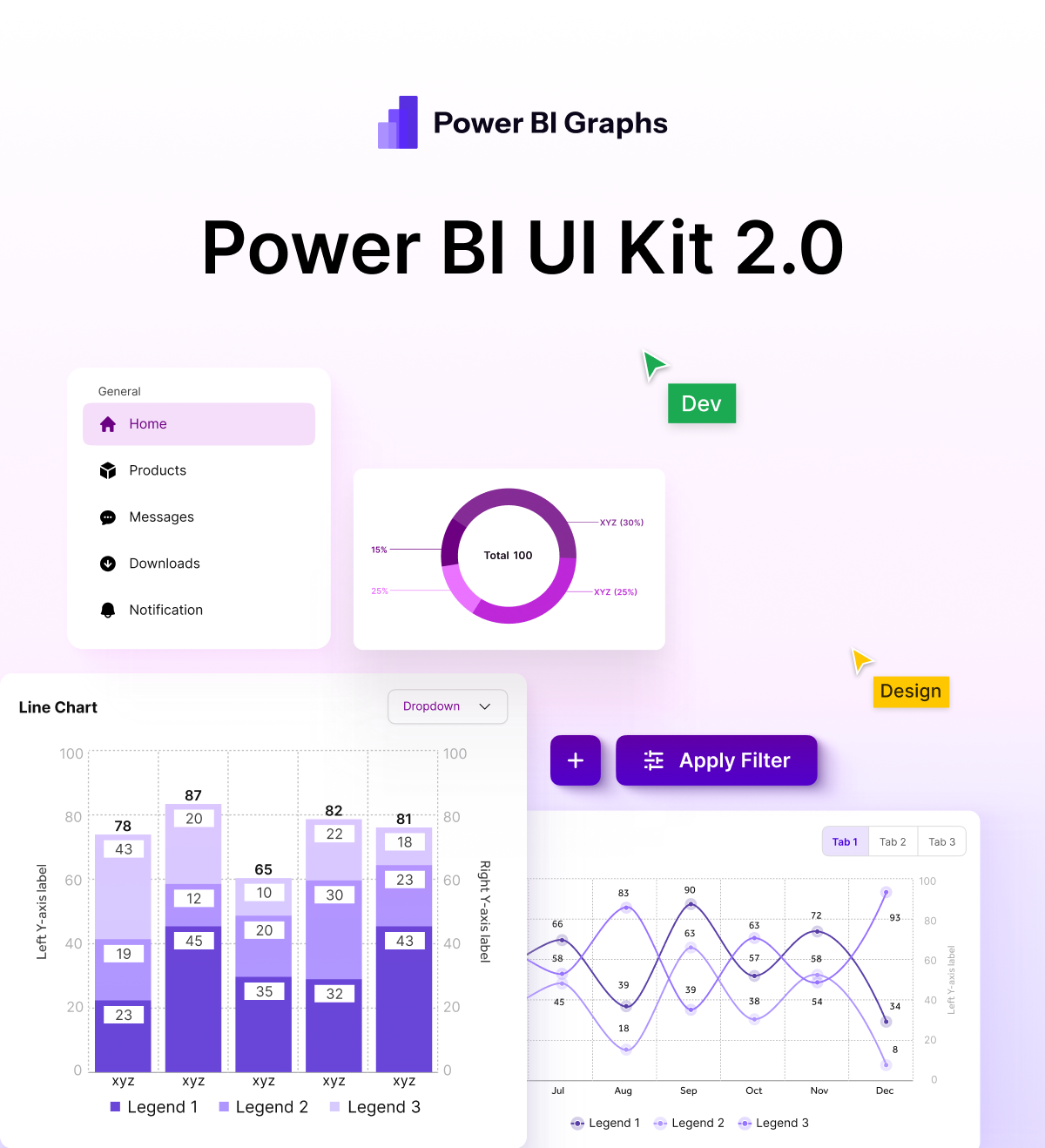
With the Power BI Figma UI Kit, you can quickly map hierarchy before developing in Power BI.
3. Ignoring Mobile Users
- The Mistake: Designing dashboards only for desktop.
- The Problem: Over 50% of executives now check dashboards on mobile and cramped visuals kill usability.
- The Fix: Design mobile-first dashboards in Figma, then adapt them to Power BI.
Power BI Graphs offers mobile-ready templates that make this easy.
4. Inconsistent Branding
- The Mistake: Dashboards that look generic and don’t reflect company identity
- The Problem: Breaks trust and feels less professional.
- The Fix: Apply consistent brand colors, typography, and styling.
Our UI Kit includes pre-designed themes aligned with modern design standards.
5. Cluttered Charts
- The Mistake: Overusing pie charts, 3D visuals, or tables with too many columns.
- The Problem: Data becomes harder to understand instead of easier.
- The Fix: Use clean, minimal charts. Stick to the right chart for the right data (bar > pie, line > cluttered tables).
6. Lack of Interactivity
- The Mistake: Static dashboards that feel like PDFs.
- The Problem: Users can’t filter, drill, or interact insights get missed.
- The Fix: Add slicers, filters, and clickable visuals to encourage exploration.
Power BI Graphs specializes in interactive dashboards + mobile app integration.
7. Designing Without a Plan
- The Mistake: Jumping straight into Power BI and “figuring it out” on the fly.
- The Problem: Leads to clutter, wasted time, and redesigns.
- The Fix: Always prototype in Figma first. Plan your layout, then move to Power BI.
That’s exactly why we built the Power BI Figma UI Kit to help teams design before they build.
How Power BI Graphs Helps You Fix These Mistakes
At Power BI Graphs, we’ve seen all of these mistakes and we’ve built solutions to fix them:
✓ Figma UI Kits for Power BI → Start with clean, responsive templates
✓ Industry-specific dashboards → Healthcare, Finance, Retail, and more
✓ Mobile App Solutions → Get dashboards your team can use on the go
✓ Custom Dashboard Services → Tailored to your KPIs and business needs
Conclusion
The difference between a dashboard that frustrates and a dashboard that inspires is design. By avoiding these 7 common mistakes and using the right tools you’ll deliver dashboards that actually drive decisions.
Ready to level up your dashboards?
- Download our Figma UI Kit for Power BI
- Book a free consultation for custom dashboards
- Discover our mobile app solutions for Power BI
Power BI Graphs: Where data meets design.
