

Table of Contents
Bar charts and pie charts are classics but relying on them alone can make your dashboards feel repetitive and one-dimensional. Power BI offers a rich library of visuals that reveal deeper insights, tell better stories, and capture stakeholder attention.
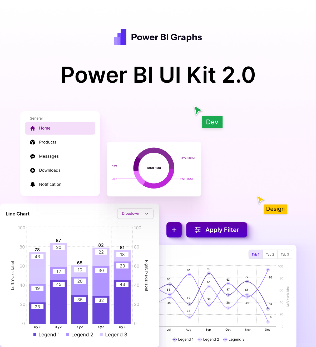
Yet many of these gems stay hidden because they seem “too complex” or “too niche.” With the right approach and with a design toolkit like Power BI Graphs you can bring these visuals to life in a way that’s both stunning and business-ready.
In this guide, we’ll explore seven overlooked Power BI visuals that go far beyond the basics, along with tips to style them for maximum impact.
1. Decomposition Tree – Drill Into the “Why”
- What it shows: A hierarchical view of your data, allowing users to break metrics down step by step.
- Best for: Root cause analysis, performance reviews.
- Styling tip: Use a clean color palette and consistent node spacing. Power BI Graphs lets you apply branded colors and typography so the tree feels like part of your corporate identity.
2. Ribbon Chart – Track Rank Changes Over Time
- What it shows: How categories change position across time or stages.
- Best for: Market share shifts, sales leaderboards, competitive analysis.
- Styling tip: Apply gradient ribbons from your brand palette and use subtle borders to make category movement stand out.
3. KPI Indicator – Instant Status at a Glance
- What it shows: Key metrics with trend indicators (up, down, flat).
- Best for: Executive dashboards, performance scorecards.
- Styling tip: Pair minimalist icons with Power BI Graphs’ custom fonts for crisp, professional KPIs.
4. Waterfall Chart – Show How You Got from A to B
- What it shows: Step-by-step changes that lead to a final value.
- Best for: Financial summaries, profit-and-loss statements, cost breakdowns.
- Styling tip: Highlight positive vs. negative contributions with carefully chosen greens and reds, keeping accessibility in mind.
5. Gauge Chart – Progress Toward a Target
- What it shows: A speedometer-style view of progress toward goals.
- Best for: Budget utilization, service-level tracking, operational metrics.
- Styling tip: Use Power BI Graphs to create on-brand gradients and modern dial effects that avoid the “clip-art” look.
6. Matrix Visual with Conditional Formatting
- What it shows: A pivot-table-like layout with rich formatting and drill-downs.
- Best for: Sales by region and product, multi-level comparisons.
- Styling tip: Combine heatmaps with subtle borders to focus attention on high-value cells without overwhelming the viewer.
7. Custom SVG Visuals – Your Brand, Your Story
- What it shows: Anything you can design in SVG—custom icons, logos, bespoke data shapes.
- Best for: Unique KPIs, branded story telling.
- Styling tip: Power BI Graphs makes it easy to import and recolor SVGs so they match your exact brand guidelines.
Design Matters as Much as Data
Great visuals lose their impact if they look cluttered or off-brand. That’s where Power BI Graphs comes in. With ready-made UI kits, curated color palettes, and pixel-perfect templates, you can:
- Apply your company’s color scheme with a single click.
- Maintain consistency across every page and visual.
Save hours on formatting so you can focus on insights, not design.
Key Takeaways
- Moving beyond bar and pie charts unlocks deeper insights.
- Underused visuals like decomposition trees and ribbon charts tell richer stories.
- Professional styling with Power BI Graphs turns any dashboard into a stakeholder magnet.
Conclusion
Your dashboards aren’t just reports they’re decision-making tools.
Stop settling for the ordinary.
Explore Power BI Graphs today and transform every report into a story stakeholders will remember.
