
Table of Contents
A New Era for Power BI Dashboard Design
For years, designing Power BI dashboards that looked as good as they performed was a challenge. Templates were inconsistent, charts didn’t align perfectly, and building a modern, branded visual language inside Power BI often felt like stitching pieces together.
That’s why we built PowerBI Graphs V2 — a fully re-engineered Figma UI Kit and design system made specifically for Power BI professionals, UI/UX designers, and analytics teams who want to combine clarity, consistency, and creativity in every dashboard.
What Is Power BI Graphs V2?
Power BI Graphs V2 is not just an update — it’s a complete redesign of how dashboard interfaces are imagined before development.
Built entirely in Figma, V2 introduces a modular, variable-driven design system that lets you create and customize dashboards visually — just like a front-end developer would with design tokens.
With over 300 components, 4800 variants, and 5 industry-specific templates, V2 transforms dashboard design into a fast, scalable, and brand-ready process.
1. Design System Foundation: Built for Consistency
At its core, V2 introduces a fully componentized architecture — every chart, card, KPI, and filter follows a shared grid and spacing logic.
You can drag, resize, or restyle without breaking alignment. Whether you’re designing a finance report or a marketing performance dashboard, the spacing, colors, and typography all stay perfectly consistent.
Highlights:
Auto-Layout 5.0 for pixel-perfect stacking
Unified spacing and padding tokens
Smart layering for nested components
Clean naming convention for easy developer handoff
2. Dual Theme System: Light + Dark Mode in One Click
Data looks different in every environment — and now your design can too.
With Figma Variables, PowerBI Graphs V2 introduces a one-click theme switcher that instantly adapts every element from light to dark.
This isn’t a duplicated file — it’s a true variable-based theme that mirrors how Power BI itself handles theme JSONs.
Benefits:
Real-time theme previews
Automatic contrast adjustments for accessibility
Brand-specific color overrides with tokens
Unified palette:
#6030FF,#E83CFE,#1447E6,#FFA245,#FF8001
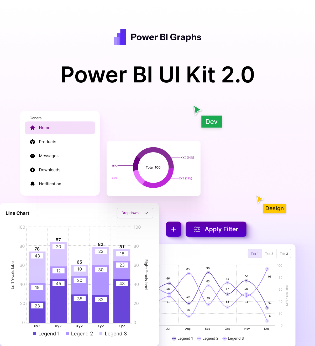
3. Expanded Chart Library: From KPIs to Cohorts
V2’s biggest upgrade is its chart diversity.
The library now includes advanced analytics visuals like funnel, waterfall, cohort, and radar charts — all component-ready and editable.
You can mix and match chart styles, resize instantly, and create custom layouts without starting from scratch.
Available Visuals:
KPI cards (single & multi-metric)
Line / Bar / Donut / Area / Funnel / Waterfall
Radar / Cohort / Heatmap / Comparison cards
Custom filters and date selectors
Each component follows real Power BI spacing logic, so what you design mirrors what you’ll build later.
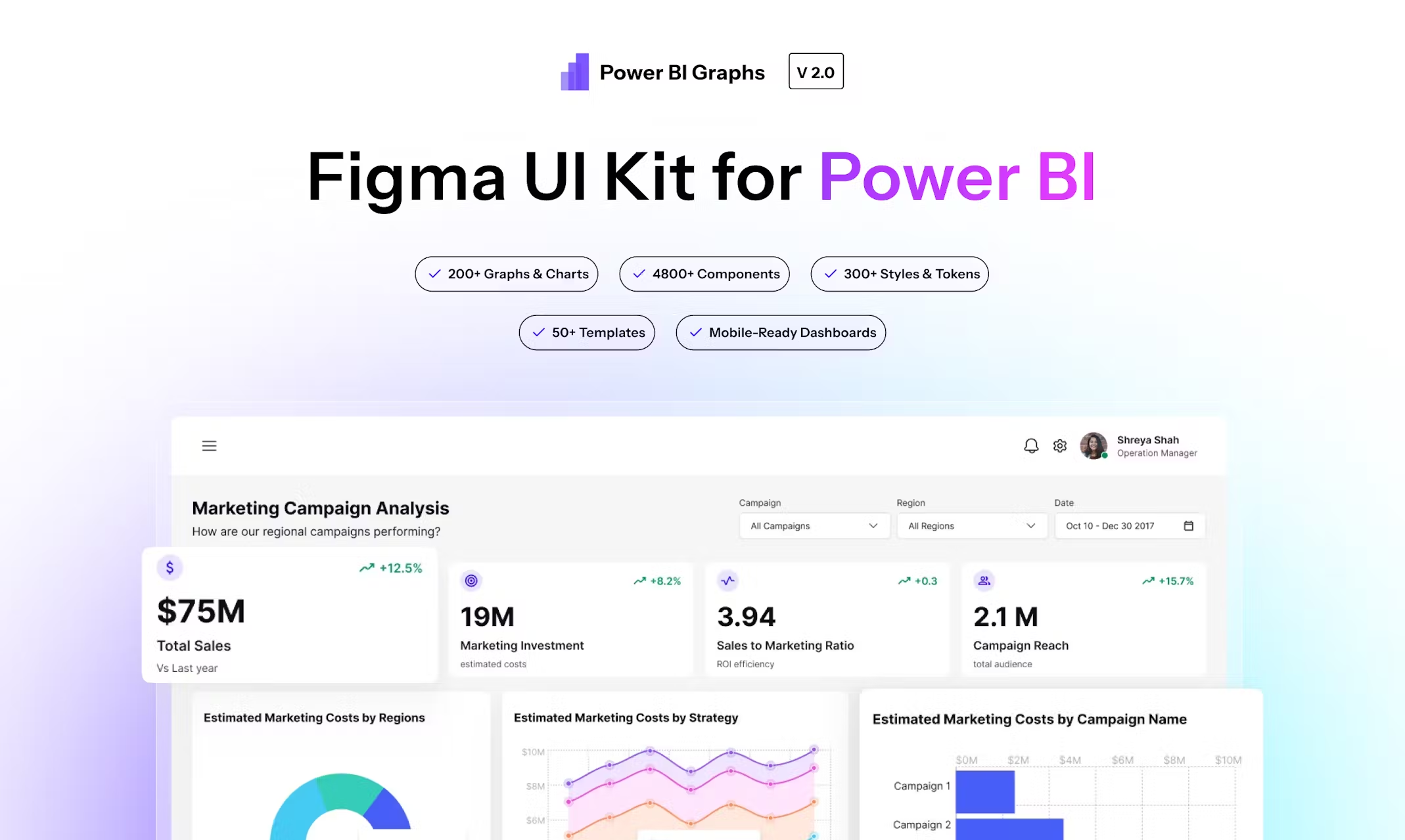
4. Industry-Specific Dashboards: Ready-to-Use Templates
To make your workflow faster, PowerBI Graphs V2 includes five pre-built dashboard templates tailored to real-world use cases:
SaaS Performance Dashboard — ARR, churn, MRR, growth trends
Finance & Profitability Dashboard — P&L, cost variance, margin analysis
HR Analytics Dashboard — attrition, hiring trends, employee KPIs
Marketing Campaign Insights — ROI, engagement, funnel performance
Operations & Inventory Overview — supply, demand, utilization metrics
Each is fully editable — switch themes, change data cards, and adapt to your brand with just a few clicks.
5. Mobile & Tablet Layouts: Design That Travels with You
Dashboards aren’t just for desktops anymore.
V2 includes responsive mobile and tablet views designed to fit Power BI’s mobile experience perfectly.
This lets design teams preview the full end-to-end user journey — from executive reports on desktop to field dashboards on phones.
6. Design Tokens & Variables: Your Brand, Your Rules
PowerBI Graphs V2 is built entirely on a tokenized system — meaning your brand colors, typography, and shadows are all variable-controlled.
Change one token, and your entire dashboard updates automatically.
Perfect for agencies or enterprise teams maintaining multiple clients or white-label dashboards.
Token Types:
Color tokens (background, accent, neutral)
Typography tokens (heading, metric, caption)
Radius + Shadow tokens for depth consistency
7. Built for Figma Dev Mode + Handoff
Every component is developer-ready.
Each element carries intuitive naming and consistent spacing values to make developer handoff seamless inside Figma’s Dev Mode.
This ensures design intent directly translates into your Power BI or React-based front-end implementation.
Why This Matters
In Power BI, design is often an afterthought — but it shouldn’t be.
A clean, well-structured dashboard not only makes insights clearer but also builds trust in the data.
PowerBI Graphs V2 helps design teams:
Save hours of layout and alignment time
Maintain visual harmony across reports
Present dashboards that look enterprise-grade from day 1
Final Thoughts
With Power BI Graphs V2, we’re not just giving you a Figma file we’re giving you a visual language for analytics.
It’s where design systems meet data visualization.
🎨 Design faster. Prototype smarter. Impress stakeholders.
Everything you need to build beautiful Power BI dashboards — now in one system.
👉 Explore Power BI Graphs V2 → powerbigraphs.com
