
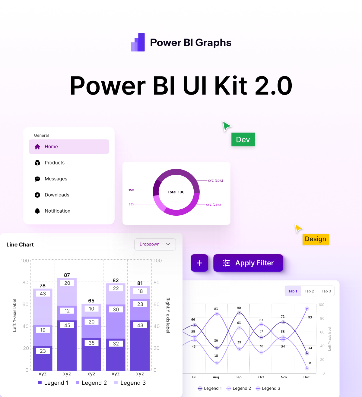
Table of Contents
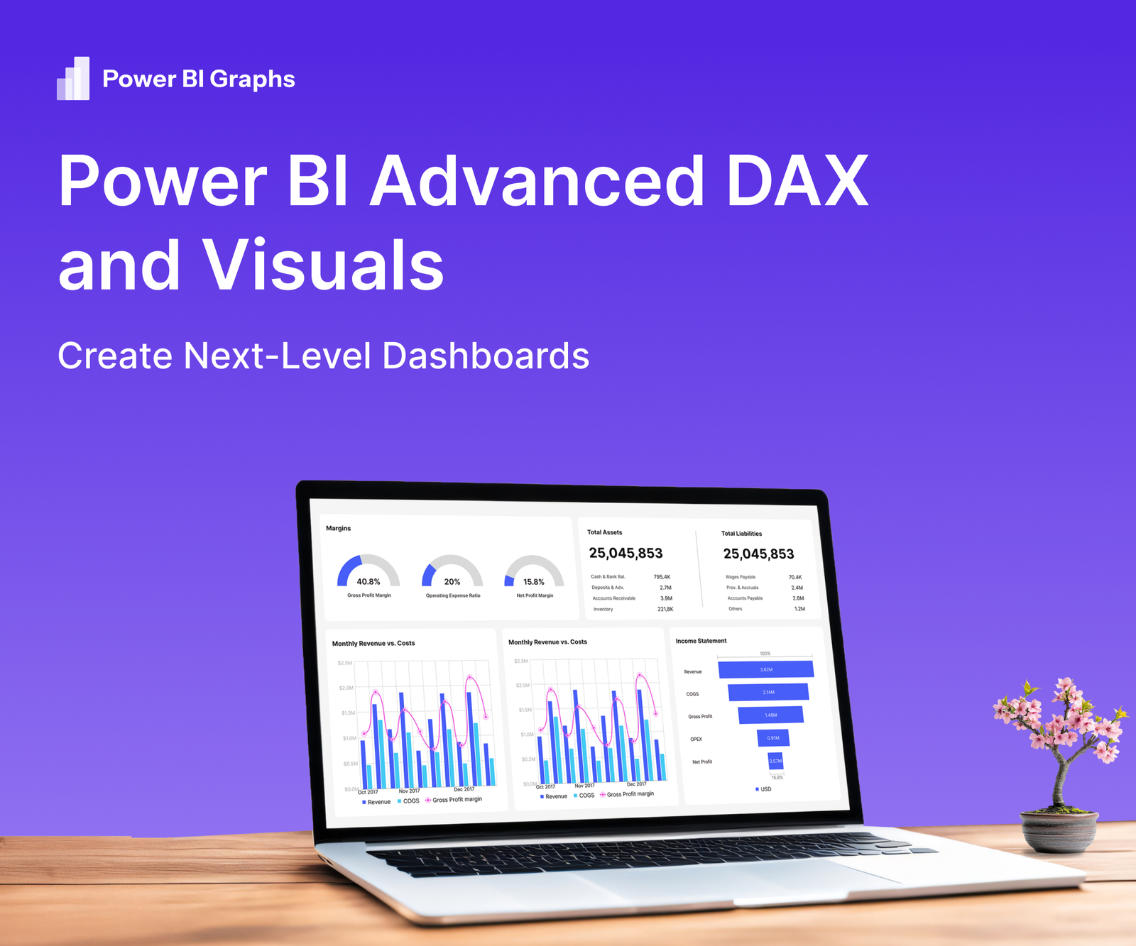
Modern business leaders don’t just want to see data they expect dashboards that reveal trends, predict outcomes, and highlight actions. Advanced DAX (Data Analysis Expressions) combined with rich visuals can transform a standard Power BI report into a true decision-making tool. With Power BI Graphs, you can implement these techniques while maintaining a consistent, polished brand style.
Why Go Beyond Basics
- Deeper Insights: Complex calculations (running totals, dynamic time intelligence, custom KPIs) turn raw numbers into actionable metrics.
- Interactive Exploration: Advanced visuals invite executives to slice and drill into data from multiple angles.
- Brand Credibility: High-quality design reinforces trust and keeps reports aligned with corporate identity.
Advanced DAX Techniques to Know
Time-Intelligence Functions
- DATESYTD, SAMEPERIODLASTYEAR: Compare performance across periods.
- PARALLELPERIOD: Create dynamic year-over-year growth visuals.
Calculation Groups
- Reduce repetitive measures by grouping calculations such as growth rates or currency conversions.
Dynamic Titles & Labels
- Use SELECTEDVALUE or FORMAT to update chart titles and tooltips based on user filters.
What-If Parameters
- Model scenarios (pricing changes, demand shifts) with real-time user input.
Visuals That Elevate Dashboards
Custom Visual Marketplace
Leverage visuals like Decomposition Trees, Synoptic Panels, and KPI Indicators to present complex relationships.
Conditional Formatting & KPI Cards
Highlight anomalies or threshold breaches instantly with color-coded visuals.
Bookmarks & Drill through Pages
Provide guided navigation without cluttering the main dashboard.
Integrated Brand Themes with Power BI Graphs
Apply your corporate color palette, typography, and iconography in one click, ensuring every visual reflects your brand.
How Power BI Graphs Streamlines the Process
- Theme Builder: Build and share reusable brand themes for all advanced visuals.
- Performance Optimizer: Identify heavy DAX measures and suggest aggregations to keep dashboards responsive.
- Template Library: Start with pre-designed layouts suited for complex metrics and high-density visuals.
Best Practices for Next-Level Dashboards
- Plan Your Data Model: A clean star schema supports complex DAX while keeping performance high.
- Measure Efficiency: Use variables (VAR) in DAX to simplify calculations and reduce query load.
- Balance Design & Speed: Test visuals for refresh time, especially when using large datasets or custom visuals.
- Governance & Security: Implement role-level security to protect sensitive measures.
Conclusion
Advanced DAX unlocks deep analytics, and high-impact visuals transform those insights into stories executives can act on. Power BI Graphs ensures these sophisticated dashboards remain fast, branded, and easy to maintain.
Ready to create next-level dashboards?
Explore Power BI Graphs or request a demo to see advanced DAX and visuals in action.
