

Table of Contents
We’ve all been there. You open a dashboard expecting insights, but what you get is a cluttered page filled with basic charts that look more like spreadsheets than decision-making tools.
Generic dashboards don’t just look dull they slow down your business. Teams spend extra time filtering data, executives struggle to get high-level clarity, and adoption suffers because nobody wants to use a boring tool.
That’s why we built PowerBIGraphs.
Our mission is simple: to make Power BI dashboards and apps more powerful, beautiful, and user-friendly.
Why Standard Dashboards Aren’t Enough
Even though Microsoft Power BI is one of the best analytics platforms in the world, its default templates often fall short. Here’s why most dashboards end up being “just okay”:
Too generic → They don’t match your industry or your KPIs.
Visually uninspiring → They look flat and fail to engage users.
Time-consuming → Designing and customizing from scratch is slow.
Limited mobile experience → The Power BI mobile app doesn’t allow deep customization.
The result? Dashboards that your team avoids instead of embraces.
How Power BI Graphs Changes the Game
At Power BI Graphs, we go beyond the basics. We help businesses transform dashboards into decision-making tools that are engaging, scalable, and tailored to their industry.
Here’s how we do it
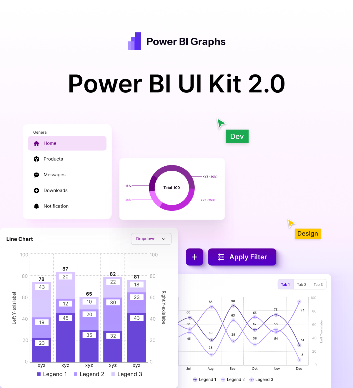
1. Figma UI Kit for Power BI (Desktop & Mobile)
Designing dashboards from scratch can take hours. That’s why we created a Figma UI Kit for Power BI.
Pre-built layouts and visual components
Ready for both desktop and mobile dashboards
Speeds up the design cycle dramatically
Ensures brand consistency with colors, fonts, and styles
Result: Dashboards that look professional, modern, and consistent in half the time.
2. Industry-Specific UI Kits & Custom Dashboard Design
Every business is unique. A hospital doesn’t measure success the same way a retailer or logistics company does. That’s why generic templates don’t work.
With PowerBIGraphs, you get:
Industry-specific UI kits → Pre-designed dashboards tailored to retail, finance, healthcare, logistics, e-commerce, and more.
Custom dashboard design services → Fully personalized dashboards built around your KPIs, workflows, and decision-making processes.
Better adoption → Dashboards designed for clarity, relevance, and ease of use.
Instead of forcing your team to adapt to a generic template, your dashboard adapts to you.
3. Custom Mobile Apps with Interactive Graphs
Here’s the truth: the standard Power BI mobile app has limits. For field teams, executives, and on-the-go users, this means missed opportunities.
That’s why we also design custom mobile apps with:
Interactive, touch-friendly graphs
Enhanced user experience tailored to mobile workflows
Offline + online access for field teams
Seamless integration with your Power BI datasets
Your data becomes accessible anytime, anywhere, without compromise.
The Benefits of Upgrading with Power BI Graphs
By moving beyond boring dashboards, businesses gain:
Clarity → Data that’s easy to understand at a glance
Speed → Faster decision-making with actionable insights
Engagement → Dashboards that people actually enjoy using
Scalability → Solutions that grow with your business needs
Brand alignment → Visuals that reflect your company’s identity
Conclusion: Say Goodbye to Boring Dashboards
Your dashboards should do more than just display data. They should engage, inspire, and empower your team to act on insights.
With PowerBIGraphs, you can:
Upgrade to beautiful, interactive dashboards
Design faster with our Figma UI kit
Use industry-specific templates that match your business
Take dashboards mobile with custom apps
Stop struggling with boring dashboards. Start transforming your data into powerful stories with PowerBIGraphs.
Explore our Figma UI Kit for Power BI
Book a Discovery Call for custom dashboards.
Learn about our Custom Mobile App Solutions.
Power BI Graphs: Where data meets design.
