
Table of Contents
🎨 Color Is Not Decoration — It’s Decision Psychology
In BI dashboards, color isn’t about aesthetics.
It’s about guiding attention, reducing cognitive load, and helping users make faster decisions.
Yet many dashboards misuse color:
-
Too many bright accents
-
Random color assignments
-
Inconsistent usage across charts
-
No distinction between “important” and “informational”
-
Colors that look fine in isolation but fail at scale
PowerBI Graphs V2 approaches color differently — through design tokens built on psychology, consistency, and scalability.
🔥 Why Color Matters in Data Interpretation
Human brains process visuals faster than text.
Color is the first thing users notice — before numbers, labels, or charts.
Poor color usage leads to:
-
Slower comprehension
-
Misinterpreted trends
-
Visual fatigue
-
Distrust in the dashboard
Great color systems do the opposite:
-
Highlight what matters
-
Reduce noise
-
Create visual hierarchy
-
Improve clarity across complex data
🧠 The Psychology Behind Effective Dashboard Colors
1. Color = Priority
In BI dashboards:
-
Primary colors indicate focus metrics
-
Muted colors support context
-
Accent colors highlight exceptions or actions
If everything is colorful, nothing stands out.
PowerBI Graphs V2 limits accent usage intentionally — so when a metric is highlighted, it truly matters.
2. Consistency Builds Trust
When the same color means different things across charts, users get confused.
Example:
-
Green = “good” in one chart
-
Green = “neutral” in another
V2 avoids this by enforcing semantic color tokens:
-
Success
-
Warning
-
Error
-
Neutral
-
Highlight
Meaning stays consistent everywhere.
3. Contrast Improves Readability
Low contrast is one of the biggest reasons dashboards fail accessibility checks.
PowerBI Graphs V2 ensures:
-
Text contrast meets readability standards
-
Charts remain legible in both light & dark modes
-
Backgrounds never overpower data
Good contrast = less eye strain + faster scanning.
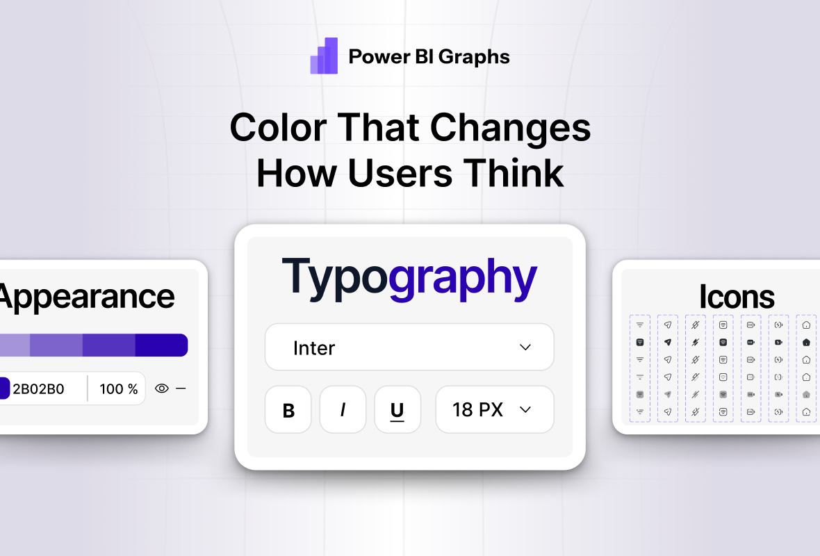
🎨 How Design Tokens Fix Color Chaos
Instead of assigning colors manually, PowerBI Graphs V2 uses color tokens.
Examples:
-
Color.Background.Primary -
Color.Text.Primary -
Color.Accent.Highlight -
Color.Status.Success -
Color.Status.Warning
Every chart, card, KPI, and label references these tokens.
So when a color changes —
the entire system updates automatically.
🧱 Token-Based Color System in Power BI Graphs V2
1. Foundation Colors
Used for:
-
Backgrounds
-
Surfaces
-
Cards
-
Layout structure
These stay subtle and never compete with data.
2. Data Colors
Used for:
-
Chart series
-
Comparisons
-
Categories
Optimized for:
-
Color-blind safety
-
Visual distinction
-
Light & dark mode compatibility
3. Semantic Colors
Used for:
-
Success / failure
-
Alerts & warnings
-
Threshold breaches
Meaning is preserved across all dashboards.
🌗 Color Tokens Across Light & Dark Modes
One of the biggest advantages of tokens is mode adaptability.
When switching themes:
-
Background tokens update
-
Text tokens adjust contrast
-
Chart palettes rebalance
-
Accent colors remain readable
You don’t redesign for dark mode.
You adapt automatically.
💡 What This Means for BI Teams
✔ Faster design decisions
No debating colors for every chart.
✔ Clear visual hierarchy
Users instantly know what to focus on.
✔ Brand consistency
Client brand colors can be mapped to tokens easily.
✔ Accessibility-ready dashboards
Improved readability for all users.
✔ Scalable systems
Works across 10 dashboards or 100.
🚀 Final Thought
Color is one of the most powerful tools in data visualization —
but only when it’s controlled, intentional, and consistent.
With design tokens, Power BI Graphs V2 turns color from a guessing game into a system.
Design dashboards that don’t just look good —
but think clearly.
👉 Explore Power BI Graphs V2 → https://powerbigraphs.com
