
Table of Contents
The Meeting That Changed Everything
The quarterly review was supposed to wow the board.
Yet when the slides went up, the CFO frowned.
“All I see are numbers,” she said. “Where’s the story? What should we do with this data?”
Data analyst Arjun felt the sting. He’d packed weeks of insights into that single static dashboard, but it looked like every other spreadsheet the board had ever seen. He needed a way to guide leaders through the data so each click revealed the next chapter like turning the pages of a well-crafted novel.
The Spark of an Idea
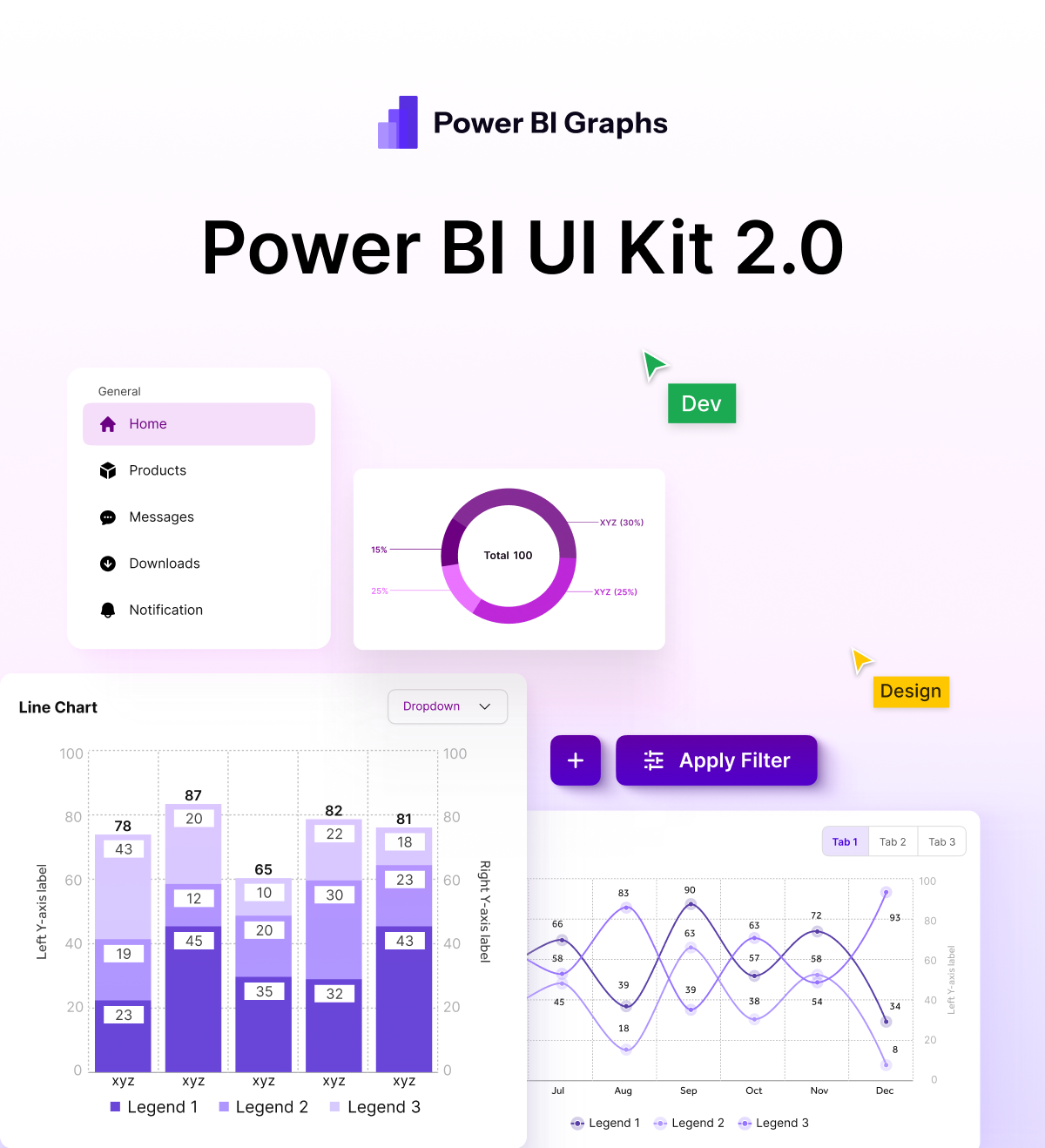
That evening, while exploring design resources, Arjun stumbled across Power BI Graphs.
The phrase “interactive storytelling” caught his eye. Instead of just showing KPIs, this platform promised to create click-through journeys, where executives could explore data at their own pace while staying immersed in the brand experience.
The Transformation Plan
Map the Narrative
Arjun sketched a storyline:
- Act 1: High-level revenue overview.
- Act 2: Regional performance deep-dive.
- Act 3: Product trends and customer behaviour.
- Finale: Actionable recommendations.
Each section would be a “chapter” that users could enter with a simple click.
Design the Experience with Power BI Graphs
- Linked Pages & Bookmarks: He set up seamless navigation so executives could jump from overview to detail with a tap.
- Dynamic Buttons & Tooltips: Instead of static text, subtle animations and pop-up explanations kept the board engaged.
- Branded Theme: The corporate colour palette and typography were baked in so every page felt like part of the company’s story.
Add Data-Driven Highlights
Power BI Graphs suggested key metrics to spotlight when a user hovered or clicked guiding the audience to the most critical insights without overwhelming them.
The Big Reveal
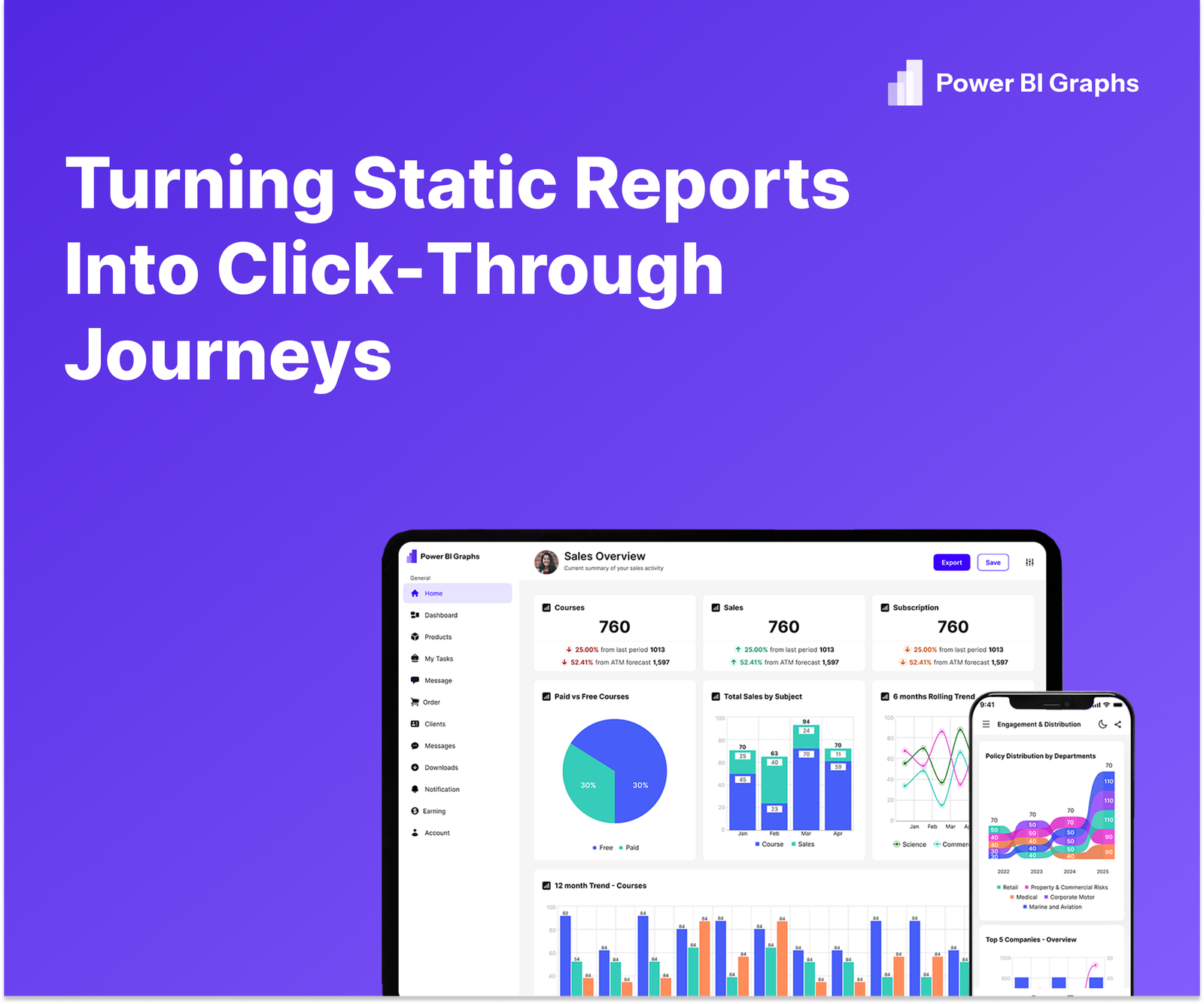
At the next board meeting, the CFO clicked the “Start Journey” button. The dashboard unfolded like a guided tour:
- A macro view of revenue trends set the stage.
- A single click zoomed into regional patterns, revealing an unexpected surge in the West Zone.
- Another click exposed customer churn signals, accompanied by a short narrative overlay.
Executives asked sharper questions, remembered key findings, and left with clear action points. “This isn’t a dashboard,” one director said. “It’s a story I’ll remember.”
Your Interactive Storytelling Toolkit
- Plan Your Plot: Identify the beginning, conflict, and resolution in your data.
- Use Visual Hierarchy: Larger visuals for key metrics, smaller ones for supporting details.
- Add Navigation: Bookmarks, buttons, and page transitions keep the flow natural.
- Stay On Brand: Apply Power BI Graphs templates to keep every click aligned with your corporate identity.
Conclusion
Static reports are yesterday’s news. Today’s leaders want data journeys and Power BI Graphs makes them effortless.
Ready to turn your next dashboard into a clickable story?
Start your free trial of Power BI Graphs or schedule a demo to see storytelling in action.
