Every dashboard tells a story.
Unfortunately, many tell the wrong one.
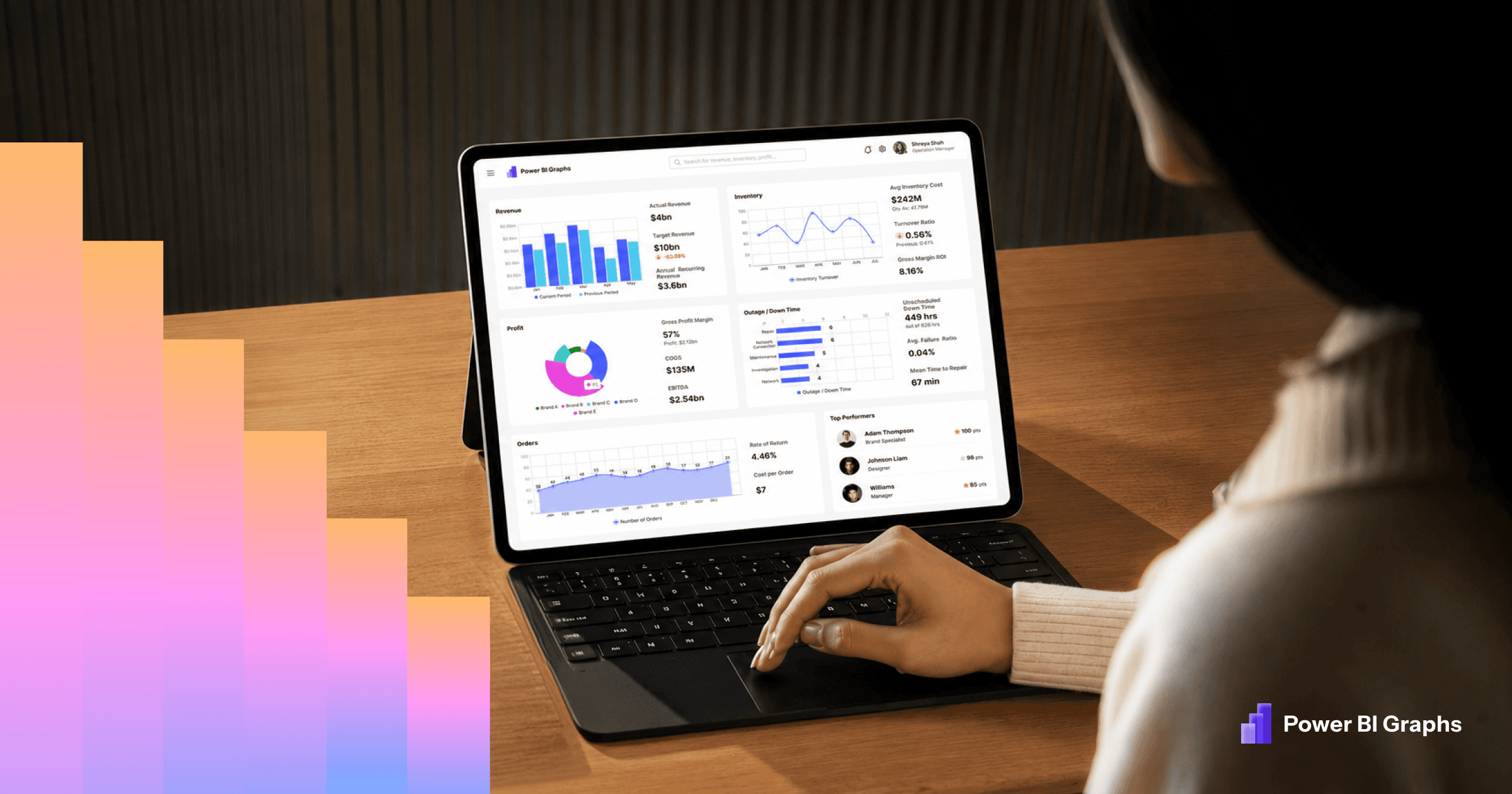
Business dashboards are created to help people make better decisions, yet countless Power BI reports overwhelm users with too much information, inconsistent layouts, and confusing navigation. The data may be accurate, but if decision-makers struggle to understand what matters within a few seconds, the dashboard has failed its purpose.
Professional dashboard design is not about making reports look attractive. It is about presenting information in a way that helps people identify trends, monitor performance, and take action with confidence.
This guide explains the principles behind effective Power BI dashboard design and the practices used by successful BI teams to create dashboards that are clear, scalable, and user-friendly.
Why Dashboard Design Matters
Power BI is a powerful analytics platform, but the quality of a dashboard depends on the design decisions behind it. Dashboards become valuable when they simplify complexity and guide attention toward the metrics that matter.
Well-designed dashboards improve adoption, reduce training time, create consistency across reports, and help organizations make faster decisions.
Start With Business Goals
Every dashboard should answer specific business questions. Before designing visuals, identify:
- Who will use the dashboard?
- What decisions should they make?
- Which KPIs matter most?
- How often will they use it?
A dashboard built around clear objectives is always more effective than one built around available data.
Build a Clear Information Hierarchy
Users should understand a dashboard within seconds.
Arrange information from most important to least important:
- Executive KPIs at the top
- Supporting trends in the middle
- Detailed analysis below
- Secondary information at the bottom
Whitespace, spacing, typography, and sizing all contribute to visual hierarchy.
Keep Layouts Consistent
Consistency builds confidence.
Professional dashboards use the same:
- Grid system
- Card styles
- Colors
- Spacing
- Navigation
- Typography
This allows users to focus on insights rather than learning a new interface every time.
Design KPIs That Drive Action
KPI cards should immediately communicate performance.
Include:
- Current value
- Previous comparison
- Trend indicator
- Target progress
- Clear labels
Avoid decorative elements that distract from the metric.
Choose the Right Visual
Every chart should answer a business question.
Common choices include:
- Line charts for trends
- Bar charts for comparisons
- Tables for detailed records
- KPI cards for headline metrics
- Maps for geographic insights
Avoid using visuals simply because they look attractive.
Use Color With Purpose
Color should highlight meaning, not decorate dashboards.
Best practices include:
- One primary brand color
- Consistent success and warning colors
- Neutral backgrounds
- Strong contrast for readability
Too many colors increase cognitive load.
Prioritize Readability
Readable dashboards use:
- Clear typography
- Logical spacing
- Descriptive titles
- Consistent iconography
- Minimal clutter
Users should never need to guess what a visual represents.
Design for Mobile
Many executives consume reports on mobile devices.
Ensure:
- Large touch targets
- Readable text
- Simplified layouts
- Critical KPIs remain visible
Responsive design should be considered from the beginning rather than added later.
Common Dashboard Design Mistakes
Many dashboards struggle because they:
- Display too many visuals
- Lack clear hierarchy
- Use inconsistent colors
- Repeat information
- Ignore whitespace
- Hide important KPIs
- Overuse slicers and filters
Removing unnecessary complexity often delivers greater improvements than adding more visuals.
Standardize With Design Systems
As organizations build more dashboards, consistency becomes difficult.
Reusable design systems help teams standardize:
- Components
- KPI cards
- Navigation
- Color palettes
- Typography
- Spacing
This reduces development time and creates a better experience across every report.
Accelerate Delivery With Templates
Professional dashboard templates provide proven layouts for common business scenarios such as HR, Sales, Finance, Retail, and SaaS analytics.
Instead of starting from a blank canvas, teams can customize an established structure and focus on business insights.
When Custom Dashboard Design Makes Sense
Templates work well for common reporting needs, but enterprise organizations often require custom solutions that align with unique workflows, branding, and governance standards.
Custom dashboard design ensures reporting experiences match business objectives while remaining scalable for future growth.
Frequently Asked Questions
What makes a professional Power BI dashboard?
A professional dashboard combines clear layouts, meaningful KPIs, intuitive navigation, consistent branding, and an excellent user experience.
Why is dashboard design important?
Good design improves usability, user adoption, reporting consistency, and decision-making speed.
Should businesses use templates?
Templates help reduce development time and improve consistency, especially when multiple dashboards are required.
What is the benefit of a dashboard design system?
A design system standardizes components, layouts, colors, and typography, enabling teams to build dashboards faster while maintaining quality.
Final Thoughts
Great Power BI dashboards do more than visualize data—they help people make better decisions.
Organizations that invest in thoughtful dashboard design create reporting experiences that are easier to understand, faster to maintain, and more valuable over time. Whether you are building dashboards from scratch, using reusable UI Kits, adopting professional templates, or investing in custom dashboard design, the goal remains the same: deliver clear insights that drive confident decisions.
At PowerBIGraphs, we believe dashboard design is just as important as the data behind it. By combining design systems, reusable UI components, professional templates, and expert design practices, teams can create modern analytics experiences that scale with their business.