Most Power BI reports start the same way.
A blank canvas, a data model, and an analyst deciding — from scratch — how big the KPI cards should be, which blue to use, and where the filter panel goes.
Multiply that decision-making across every report a team ships, and you get exactly what most organizations have today: dashboards that all look slightly different, built by people making the same design decisions over and over, independently, with no shared reference point.
A Power BI UI Kit solves that problem directly. It's not a shortcut that sacrifices quality — it's the opposite. It's the accumulated design decisions of dozens of dashboards, packaged so every new report starts from a proven baseline instead of a blank page.
Why This Matters
Design consistency is hard to maintain manually, especially as a BI team grows. New analysts join with their own visual instincts. Deadlines compress the time available for polish. Over months, a organization's reporting layer drifts into a patchwork of inconsistent fonts, mismatched KPI cards, and colors that mean different things on different pages.
A UI Kit isn't just about aesthetics. It directly affects:
- Build speed — analysts spend time on business logic, not re-deciding spacing and card sizing
- Adoption — users trust reports that look and behave consistently
- Onboarding — new team members inherit a visual standard instead of guessing at one
- Maintenance — updating a component once updates it everywhere it's used
Teams that skip this step tend to rediscover its value the hard way — usually after their fifth or sixth dashboard, when inconsistency has already become visible to stakeholders.
Core Concepts of a Power BI UI Kit
Reusable Components
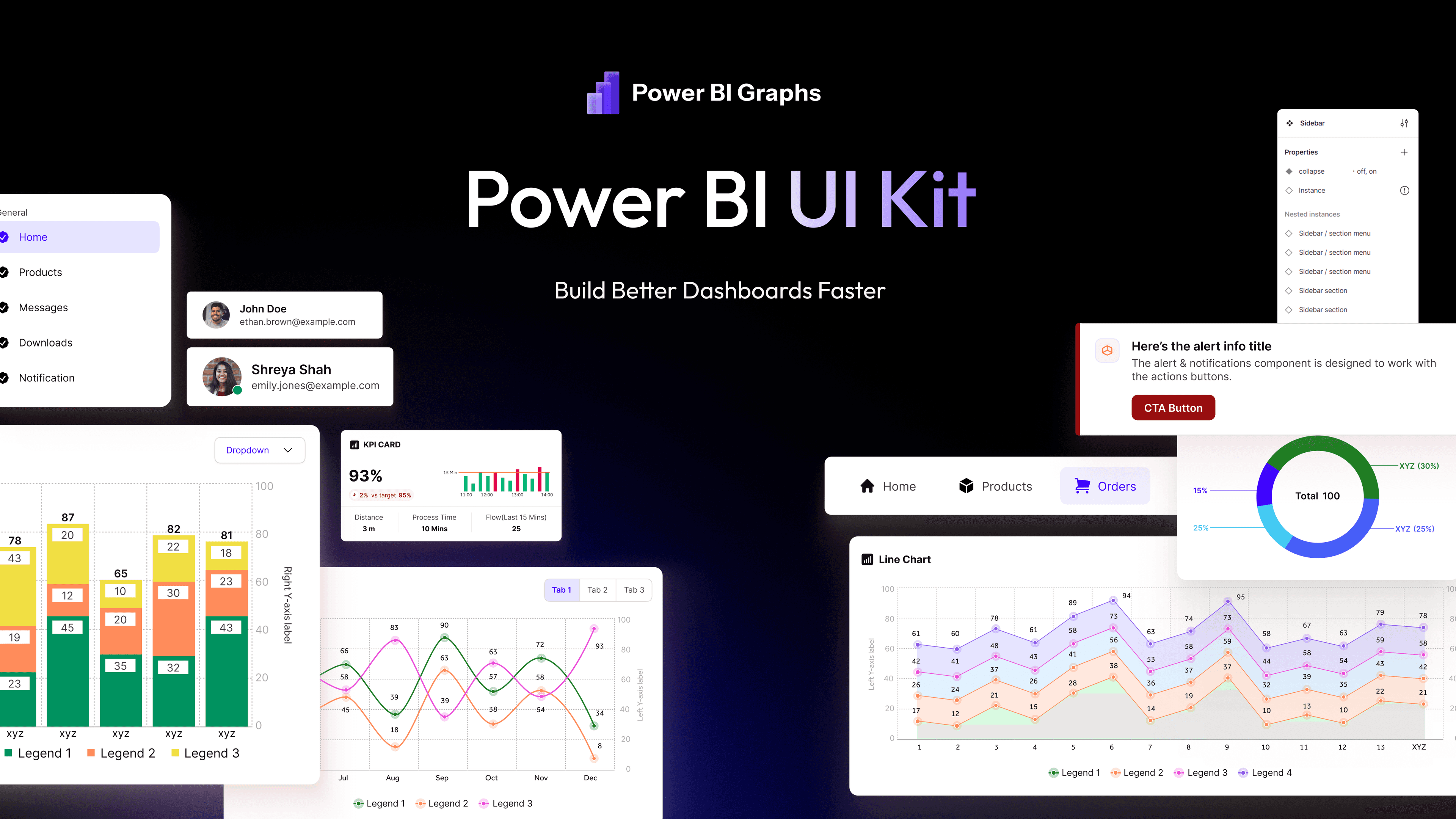
A UI Kit's core value is componentization: pre-built KPI cards, chart containers, filter panels, and navigation elements that can be dropped into any report rather than rebuilt visual-by-visual.
A Defined Visual Language
Beyond individual components, a UI Kit establishes rules — spacing scale, typography hierarchy, color meaning, and grid structure — that keep every report speaking the same visual language, even when built by different people.
Theme Files, Not Just Templates
A strong UI Kit typically ships with Power BI theme JSON files, so color palettes, font settings, and default visual formatting apply automatically rather than being configured manually report by report.
Figma-to-Power BI Alignment
The best UI Kits maintain parity between design files (often in Figma) and what's actually achievable in Power BI, so design mockups don't promise something the platform can't deliver.
Best Practices for Using a UI Kit Effectively
1. Don't treat it as a one-time download. A UI Kit delivers the most value when it's adopted as the team's ongoing standard, not just used for a single project and abandoned.
2. Customize brand colors once, at the source. Update the theme file centrally rather than adjusting colors visual-by-visual across every report. This keeps consistency intact as the kit gets reused.
3. Train new team members on the kit, not just Power BI. Onboarding should include "here's how we build dashboards here," using the kit's components as the reference standard.
4. Extend the kit deliberately. When a new component is needed — a new KPI card style, for example — add it to the shared kit rather than building a one-off that only exists in a single report.
5. Pair the kit with a documented design system. The kit provides the components; a lightweight internal guide on when and how to use them keeps decisions consistent across a growing team.
Real Examples
Consider a BI consultancy delivering dashboards for multiple clients across HR, sales, and finance functions. Without a shared UI Kit, each project starts from scratch, and design quality varies depending on which consultant is staffed on it — some are naturally strong designers, others are strong with DAX but weaker on layout.
With a shared UI Kit, every project starts from the same proven components. A consultant building a finance dashboard reuses the same KPI card structure as the one building a sales dashboard for a different client. Delivery timelines shrink because the visual decisions are already made — the work shifts to configuring the data and confirming the right metrics, not deciding how big a card should be.
Internal BI teams see a similar effect. A UI Kit becomes the equivalent of a component library in software engineering — the reason a growing team can ship consistent, professional work without every developer reinventing the button styles.
Common Mistakes When Adopting a UI Kit
| Mistake | Why It Hurts | Fix | |---|---|---| | Using the kit once, then abandoning it | Consistency erodes as soon as the next project skips it | Make the kit the default starting point for every new report | | Modifying components inconsistently per project | Creates the same fragmentation the kit was meant to solve | Centralize changes in the shared theme and component set | | Skipping team training on the kit | Analysts revert to old habits under deadline pressure | Include the kit in onboarding, not just documentation | | Treating it as design-only, ignoring the theme file | Colors and typography still get configured manually | Apply the theme file as a standard step in every build | | Never updating the kit as needs evolve | Kit becomes outdated and gets bypassed | Assign ownership for maintaining and extending it |
Professional Recommendations
- Evaluate a UI Kit the same way you'd evaluate any reusable engineering asset — by how much repeated work it eliminates, not just how it looks in a preview
- Prioritize kits that include both Figma source files and Power BI theme files, so design and build stay aligned
- Assign someone on the team as the kit's owner, responsible for keeping it current as brand guidelines or business needs shift
- Pair a UI Kit with a small library of proven Dashboard Templates for common report types — HR, sales, finance, retail, and SaaS — so teams aren't just starting with components, but with structure too
- Revisit kit adoption quarterly to confirm new reports are actually using it, not quietly diverging
UI Kit Adoption Checklist
- [ ] Theme file applied as the default starting point for new reports
- [ ] KPI card components reused instead of rebuilt per project
- [ ] Color palette centralized and consistent across all dashboards
- [ ] New team members trained on the kit during onboarding
- [ ] A named owner responsible for maintaining and extending the kit
- [ ] Figma source files kept in sync with what's built in Power BI
- [ ] Kit usage reviewed periodically to catch design drift early
Frequently Asked Questions
What's included in a typical Power BI UI Kit?
A UI Kit typically includes reusable KPI cards, chart containers, navigation components, filter panels, a Power BI theme file, and often matching Figma design files for planning new reports before building them.
Does using a UI Kit limit creative flexibility?
Not meaningfully. A good UI Kit provides a consistent foundation — spacing, typography, color logic — while still leaving room to adapt layouts to specific business needs. It removes repetitive decisions, not creative judgment.
Is a UI Kit only useful for large BI teams?
No. Solo analysts and small teams benefit too, since it removes the need to make every design decision from scratch on every project, which is often where the most time gets lost.
How is a UI Kit different from a dashboard template?
A UI Kit provides the underlying components and visual system — the building blocks. Dashboard Templates apply those components into complete, ready-to-customize reports for specific use cases like HR or Sales.
Final Thoughts
The gap between an average Power BI dashboard and a professional one usually isn't data skill — it's the accumulated weight of small, repeated design decisions made inconsistently across a growing library of reports.
A Power BI UI Kit removes that inconsistency at the source. It turns dashboard design from a series of individual judgment calls into a repeatable, professional process — one where build speed and design quality improve together, rather than trading off against each other.